RBSE Class 11 Economics Important Questions Chapter 4 Presentation of Data
Rajasthan Board RBSE Class 11 Economics Important Questions Chapter 4 Presentation of Data Important Questions and Answers.
Rajasthan Board RBSE Solutions for Class 11 Economics in Hindi Medium & English Medium are part of RBSE Solutions for Class 11. Students can also read RBSE Class 11 Economics Important Questions for exam preparation. Students can also go through RBSE Class 11 Economics Notes to understand and remember the concepts easily.
RBSE Class 11 Economics Important Questions Chapter 4 Presentation of Data
Very Short Answer Type Questions
Presentation Of Data Class 11 Important Questions Question 1.
What is meant by presentation of data?
Answer:
The presentation of data means exhibition of the data in a clear and attractive manner such that they can be easily understood and analysed.
Presentation Of Data Class 11 Extra Questions And Answers Question 2.
When is it suitable to use textual presentation of data?
Answer:
It is suitable to use textual presentation of data when the quantity of data is not too large.

Presentation Of Data Class 11 Numericals Question 3.
What is a table?
Answer:
A table is the organisation of data in rows and columns.
Presentation Of Data Class 11 Questions And Answers Question 4.
Define tabulation?
Answer:
Tabulation involves an orderly and systematic presentation of numerical data to elucidate the problem under consideration.
Class 11 Statistics Chapter 4 Important Questions With Answers Question 5.
Name the classifying variable in temporal classification.
Answer:
Time is the classifying variable in temporal classification.
Questions On Presentation Of Data Class 11 Question 6.
Give the examples of classifying variables in spatial classification.
Answer:
The examples of classifying variables in spatial classification are village, district, state and country, etc.
Presentation Of Data Questions And Answers Question 7.
List the main components of a table.
Answer:
The main components of a table are:
(i) Table number
(ii) Title
(iii) Captions or column headings
(iv) Stubs or row headings
(v) Body of the table
(vi) Unit of measurement
(vii) Source note
(viii) Footnote
Tabular Presentation Of Data Class 11 Questions Question 8.
Write a feature of the ‘title’ of a table.
Answer:
The title of a table has to be very clear, brief and carefully chosen so that clear interpretations could be derived from the table.
Presentation Of Data Class 11 Question Bank Question 9.
Give another name for column and row heading in the table.
Answer:
Column heading is also known as caption and row heading is also known as stub.
Presentation Of Data Class 11 Extra Questions Question 10.
How is the location of a figure determined in a table?
Answer:
The location of a figure in a table is determined by the row and column of the table.
Presentation Of Data Class 11 Question 11.
What is diagrammatic presentation of data?
Answer:
In diagrammatic presentation, data is presented in the form of diagrams, figures, graphs, etc. to provide quickest understanding of the real situation.
Class 11 Statistics For Economics Chapter 4 Important Questions Question 12.
List the different kinds of diagrams.
Answer:
The different kinds of diagrams are:
(i) Geometric diagrams - bar diagram and pie diagram
(ii) Frequently diagrams - histogram, frequency polygon, frequency curve and ogive
(iii) Arithmetic line diagram or time-series graph
Class 11 Statistics Chapter 4 Questions And Answers Question 13.
How are data presented in bar diagram?
Answer:
In bar diagrams, data are presented in the form of bars or rectangles.
Questions On Tabular Presentation Of Data Question 14.
List the variables which can be best represented by bar diagram?
Answer:
Discrete variables such as family size, grades in an exam, etc. and attributes such as gender, religion, caste, etc. can be best represented by bar diagram.
Presentation Of Data In Statistics Questions And Answers Question 15.
State the use of multiple bar diagram.
Answer:
Multiple bar diagrams are used to show two or more sets of data simultaneously.
Statistics For Economics Class 11 Chapter 4 Questions And Answers Question 16.
What is a component bar diagram?
Answer:
A component bar diagram represents the bar and its sub-divisions into two or more components.
Question 17.
Why is there no open space between two consecutive rectangles of a histogram?
Answer:
While preparing a histogram, the lower class boundary of a class interval coincides with the upper class boundary of the previous interval. Thus, all the rectangles are adjacent and there is no open j space between two consecutive rectangles.
Question 18.
Define frequency polygon.
Answer:
Frequency polygon is a plane connected by line segments, formed by joining the middle-top points of all rectangles in a histogram.
Question 19.
What type of distribution is represented by an ogive?
Answer:
An give represents cumulative frequency distribution.
Question 20.
How is arithmetic line graph prepared?
Answer:
Time is plotted along x-axis and the value of the variable along y-axis. The plotted points are joined to obtain arithmetic line graph.
Short Answer Type Questions
Question 1.
State the advantages and disadvantages of textual presentation of data.
Answer:
Advantages of Textual Presentation of Data
(i) It provides useful and supportive evidence to the text in case of small volume of data.
(ii) It enables one to emphasise the important points of the presentation.
Disadvantage of lextual Presentation of Data
(i) It requires going through the complete text to draw facts.
Question 2.
Write the important features of tabulation.
Answer:
The important features of tabulation are as below:
(i) It organises the raw data, making it easy and definite.
(ii) It makes data comparable.
(iii) It facilitates calculation of statistical indices and data analysis.
(iv) It clearly indicates the features of the data.
Question 3.
Explain the various types of tables.
Answer:
The various types of tables are explained below:
(i) One-way Table: This type of table presents only single characteristic of the data. For example, a table showing the number of students in a college.
(ii) Two-way Table: It presents two features of data simultaneously. For example, a table showing the male and female population of a village.
(iii) Three-way Table: This table presents three features of the data. For example, presentation of population of a village on the basis of age, gender and education.
Question 4.
Explain temporal classification of data with the help of an example.
Answer:
In temporal classification, data is classified with reference to time such as days, weeks, months, quarters, years, etc. The table below shows the exports of Maruti Suzuki cars in terms of years. Here, the classifying characteristic is year and takes values in the scale of time.
|
Exports of Maruti Suzuki Car |
|
|
Year |
Sale (In Units) |
|
2004-2005 |
48,899 |
|
2005-2006 |
34,784 |
|
2006-2007 |
39,295 |
|
2007-2008 |
53,024 |
|
2008-2009 |
70,023 |
|
2009-2010 |
147,575 |
|
2010-2011 |
138,266 |
|
2011-2012 |
127,379 |
Question 5.
What are the features of a good table?
Answer:
The following are the important features of a good table:
(i) Title of the table should be according to the subject of study.
(ii) Row and column headings should be clear along with the units of measurements.
(iii) No short-forms should be used in the title, for example, govt for government
(iv) Footnote is to be given, if required.
(v) Combined total for every column and row should be given.
(vi) Complete information regarding numbers should be given in a table such as decimal point up to which value has been taken.
(vii) Source of data should always be mentioned below the table.
(viii) Table should be simple and easy to understand.
Question 6.
State the rules for constructing diagrams.
Answer:
Following are the rules for constructing diagrams:
(i) The diagram should be drawn strictly according to the scale.
(ii) Title of diagram should not only be easy, definite and attractive but also self-explanatory.
(iii) Necessary instructions and colours should be used along with their clarification.
(iv) The use of words and numbers should be minimum.
(v) Diagram should be neatly bordered with thick and double lines.
(vi) Diagram should always be easy and understandable.
(vii) Diagram formation should always be from left to right and up to down.
(viii) Basis of data should be clearly mentioned.
Question 7.
Write the features of bar diagrams.
Answer:
The main features of bar diagrams are:
(i) Height of bar diagram changes with the change in the frequency.
(ii) Width of all the bars is same.
(iii) Bars can be drawn either vertically or horizontally.
(iv) The distance between the bars should be equal.
Question 8.
Explain the various types of bar diagrams.
Answer:
The various types of bar diagrams are explained below:
(i) Simple Bar Diagram: In simple bar diagrams, data are presented through equi-width and equidistant bars or rectangles. Bars of different heights are made corresponding to a particular characteristic, say population, production, literacy, etc. at various points of time or of different states to construct a simple bar diagram.
(ii) Multiple Bar Diagram: Multiple bar diagrams are used to show two or more sets of data simultaneously. For example, sales and profits, exports and imports, production of vegetables and foodgrains can be shown using multiple bar diagrams.
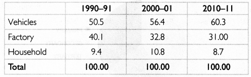
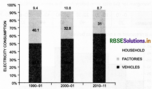
(iii) Component Bar Diagram: A component bar diagram represents the bar and its sub-divisions into two or more components. It is very useful in comparing the sizes of different components. For example, distribution of population into males, females and children; expenditure pattern in a typical Indian family; etc.
Question 9.
What are the different types of component bar diagrams.
Answer:
There are two types of component bar diagrams:
(i) Simple Component Bar Diagram: It helps in comparing the size of various elements or components and also shows relationship between the integral parts. These are represented in absolute values. Comparative bars are differentiated with colours or shades.
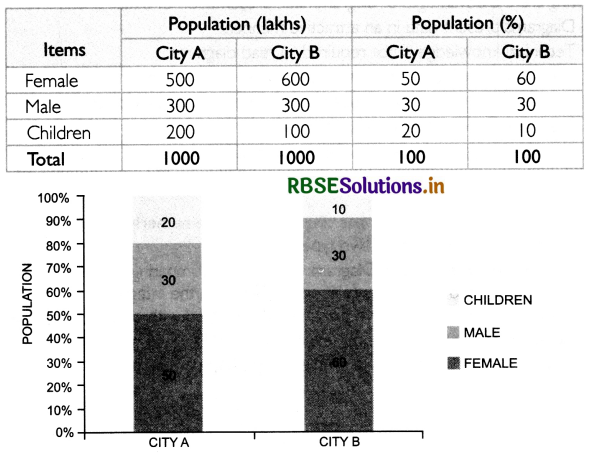
(ii) Percentage Component Bar Diagram: The area of the bar is proportionally divided among various sets of data or components. It is used when the values have high magnitude. The value of total bar length is considered as 100 and value of all the items is calculated as percentage and presented in the form of diagram.
Question 10.
Differentiate between simple bar diagram and histogram.
Answer:
Following are the points of difference between simple bar diagram and histogram:
|
Simple Bar Diagram |
Histogram |
|
In a bar diagram, some space is left between consecutive bars. |
In histogram, no space is left between two rectangles. The width in a histogram is as important as its height Histogram is drawn only for continuous variables. |
Question 11.
Write the steps to determine mode graphically.
Answer:
The steps to determine mode graphically are given below:
(i) Represent the given data in the form of a histogram. The height of the rectangles in the histogram shows the frequencies of the class interval.
(ii) Identify the highest rectangle. The class interval corresponding to the highest rectangle is the modal class of the series.
(iii) Join the top left comer of the modal rectangle with top right comer of the rectangle on the right. Also, join the top right comer of the modal rectangle with top left comer of the rectangle on the left.
(iv) Draw a perpendicular line from the point of intersection onto the x-axis.
(v) The value at which the perpendicular meets the x-axis will give the mode.
Question 12.
State the difference between:
(i) ‘Less than’ and ‘more than’ ogive
(ii) Frequency polygon and frequency curve
Answer:
(i) In ‘less than’ ogive, frequencies less than the upper class limit are shown. On the other hand, in ‘more than’ ogive, frequencies greater than the lower class limit are shown.
(ii) Frequency polygon is a plane connected by line segments, formed by joining the middle- top points of all rectangles in a histogram. On the other hand, frequency curve is a smooth freehand curve, which passes very closely through the points of the frequency polygon.
Question 13.
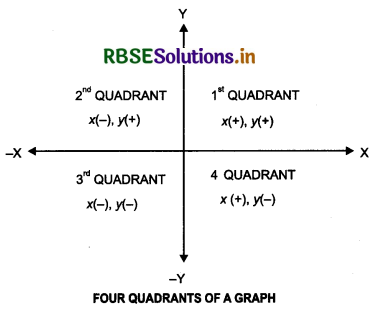
Write a short note on the quadrants of a graph.
Answer:
X-axis and Y-axis divide the graph paper into four parts. Each part is called a quadrant The numbers and their signs as marked in all the four quadrants of a graph are as follows:
|
Quadrant |
Nature of Items |
|
Ist |
x positive (+); y positive (+) |
|
2nd |
x negative (-); y positive (+) |
|
3rd |
x negative (-); y negative (-) |
|
4th |
x positive (+); y negative (-) |
It can be represented graphically as:
Question 14.
Define diagrams. Are there any limitations of diagrammatic presentation of data? Explain.
Answer:
A diagram is a drawing that represents information and relationships. Though diagrammatic presentations are quite effective methods, they do have certain limitations.
(i) Diagrams are only approximations.
(ii) Diagrams cannot represent minute differences in values.
(iii) Large differences in values can make the diagram look unattractive.
(iv) They can present only limited data.
(v) Minor mistake in studying measurement unit may produce wrong conclusion.
Question 15.
State the advantages of diagrammatic presentation of data,
Answer:
Following are the advantages of diagrammatic presentation of data:
(i) Diagrams present data in an attractive manner.
(ii) Technical knowledge is not required to read diagrams.
(iii) Huge volume of data can be seen at a glance through diagrams.
(iv) Less time and efforts are required to interpret results using diagrams.
(v) Diagrams present the data in proper perspective.
(vi) Diagrams carry with them an effective impression.
Long Answer Type Questions
Question 1.
Define each kind of tabular classification, giving examples.
Answer:
The different kinds of tabular classification are explained below:
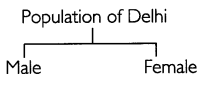
(i) Qualitative Classification: In this type of classification, data is grouped according to their qualitative characteristics.
For example, population of Delhi can be classified into males and females:
(ii) Quantitative Classification: In this type of classification, data is classified on the basis of numeric value. The table below shows the frequency distribution of monthly incomes of 50 households in a locality.
Frequency Distribution of Monthly Incomes of 50 Households in a Locality
|
Class Interval |
Frequency |
|
Below 20,000 |
18 |
|
20,000-30,000 |
12 |
|
30,000-40,000 |
7 |
|
Above 40,000 |
13 |
|
Total |
50 |
(iii) Spatial Classification: In spatial classification, data is classified according to place. The table below shows data related to sugar production in different states of India.
|
State |
Sugarcane Production |
|
Punjab Haryana Uttar Pradesh Bihar |
1,000 700 2,000 400 |
(iv)Temporal Classification: In temporal classification, data is classified with reference to time such as days, weeks, months, quarters, years, etc. The table below shows the exports of Maruti Suzuki cars in terms of years:
Exports of Maruti Suzuki Car
|
Year |
Sale (In Units) |
|
2008-2009 |
70,023 |
|
2009-2010 |
147,575 |
|
2010-2011 |
138,266 |
|
2011-2012 |
127,379 |
Question 2.
Describe in detail the components of a table.
Answer:
The main components of a table are:
(i) Table Number: An appropriate number should be assigned to a table for its identification and easy reference in future. It is given at the top or at the beginning of the title of the table.
(ii) Title: It is a brief statement of the contents of the table. It is placed at the head of the table. The title should be short and complete.
(iii) Stubs or Row Headings: It is the extreme left part of the table, which gives description of the matter presented in the rows.
(iv) Captions or Column Headings: This is the upper part of the table giving description of different columns.
(v) Body of the Table: It is the main component of the table which contains the numerical information. Each figure or data is kept in the box fixed by a row and column.
(vi) Unit of Measurement The units of measurement of the figures in the table must be provided with the title. However, if different units are used for row and column, they must be stated along the stubs and captions.
(vii) Source Note: It states the origin of the available information at the bottom of the table.
(viii) Footnote: This component shows the explanations of specific items given in the table.
Question 3.
Explain the types of component bar diagram. Also, give numerical examples.
Answer:
Component bar diagrams are of two types:
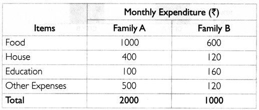
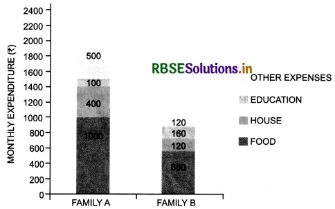
(i) Simple Component Bar Diagram: It helps in comparing the size of various elements or components and also shows relationship between the integral parts. These are represented in absolute values. Comparative bars are differentiated with colours or shades.
Example: The details of monthly expenditures of Family A and Family B are given. On the basis of this data, we will prepare a simple component bar diagram:
(ii) Percentage Component Bar Diagram: The area of the bar is proportionally divided among various sets of data or components. it is used when the values have high magnitude. The value of total bar length is considered as 100 and value of all the items is calculated as percentage and presented in the form of diagram.
Example: The details of population of City A and City B are given. On the basis of this data, we will prepare a percentage component bar diagram:
Question 4.
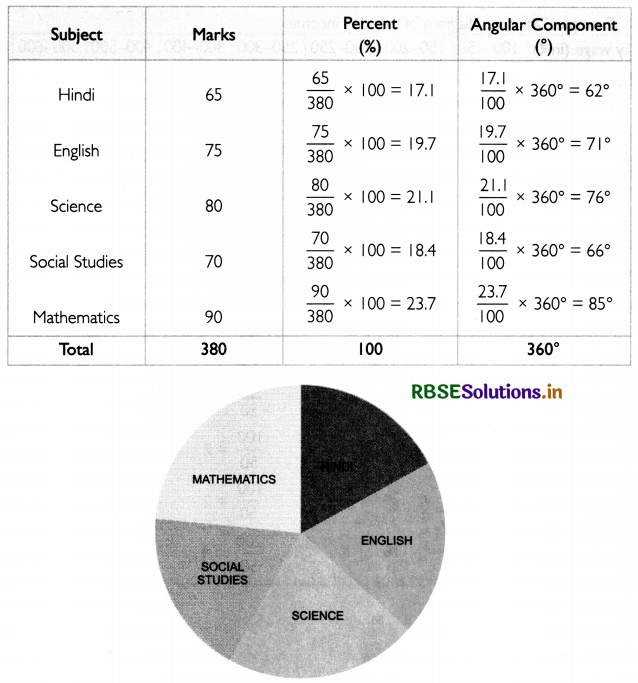
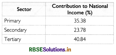
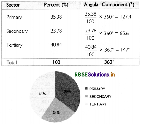
Explain the steps for the construction of pie diagram with the help of an example.
Answer:
While constructing a pie diagram, a circle is divided into various segments showing the percent values of a series.
Example: Present the data relating to Riya's marks in different subjects using pie diagram.
|
Subject |
Marks |
|
Hindi |
65 |
|
Total |
380 |
The following are steps for the construction of a pie diagram:
(i) Convert all the values as percentage of the total value.
(ii) Find the corresponding value in degrees for each percentage value, using the formula
\(\text { Angle }=\frac{\text { Percentage }}{100} \times 360^{\circ}\)
(iii) Draw a circle of any radius.
(iv) Present the converted angle into it by drawing a radius. In this method, cumulative angles are used.
Question 5.
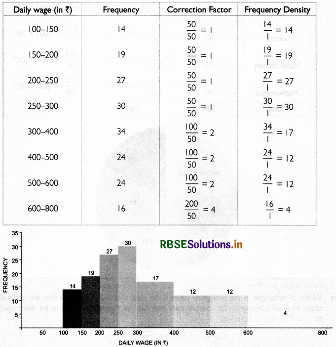
How would you draw the histogram for unequal class intervals.
Answer:
Width of rectangles in the histogram varies if the class intervals in a distribution are unequal. In order to draw a histogram for unequal class intervals, the frequencies need to be rearranged by taking a ‘Correction factor as:
Correction Factor \(=\frac{\text { Class interval }}{\text { Least interval }}\)
After this, calculate the frequency density as:
Frequency Density \(=\frac{\text { Frequency }}{\text { Correction factor }}\)
The frequencies so obtained are presented in the histogram.
Example: Draw the diagram of monthly income.

Answer:
The least class interval is 50 and the highest is 200. Calculate frequency density as shown below
Question 6.
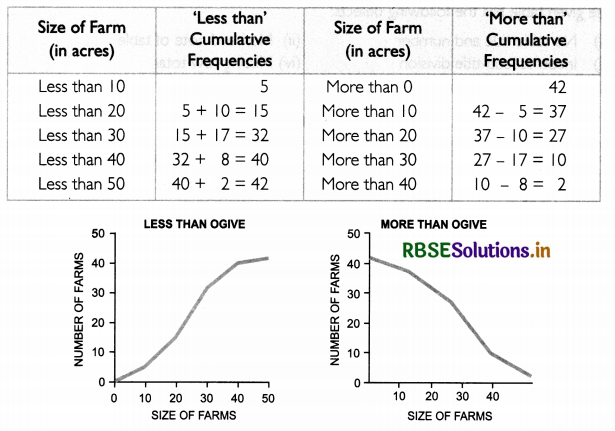
Describe cumulative frequency curve or ogives.
Answer:
Ogive is the curve constructed by plotting cumulative frequency data on the graph paper, in the form of a smooth curve. Cumulative frequency curve is of two types.
(i) ‘Less than’ Ogive: In ‘less than’ ogive, the cumulative frequencies are plotted against the respective upper limits of the class intervals.
(ii) ‘More than’ Ogive: In ‘more than' ogive, the cumulative frequencies are plotted against the respective lower limits of the class intervals
Example: Create ‘less than’ and ‘more than' ogive for the data given below.

Answer:
Below is the table showing the ‘less than’ and ‘more than’ cumulative frequencies:
Numerical Questions
Question 1.
Draw a table to present the educated and uneducated population of India in the Census years
1951, 1961,1971, 1981, 1991 and 2001.
Answer:
The table below presents the educated and uneducated population of India:
Table 1: Educated and Uneducated Population of India (in %)
|
Census Year |
% of Population |
Total |
|
|
Educated |
Uneducated |
||
|
1951 |
|
|
|
Question 2.
Find the errors in the following table. Also. present the correct table.
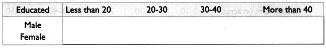
Answer:
The given table has the following defects:
(i) No table title and number
(ii) No head note of table
(iii) Incorrect sub-title division
(iv) Missing row total
Correct form of the table will be:
Table Population Distribution
|
Age |
Educated |
Uneducated |
||||
|
Male |
Female |
Total |
Male |
Female |
Total |
|
|
Less than 20 20-30 30-40 More than 50 |
|
|
|
|
|
|
|
Total |
|
|
|
|
|
|
Diagrammatic Presentation of Data
Question 1.
Present following data in a simple bar diagram:
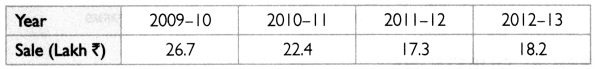
Answer:
The data is presented ¡n a simple bar diagram as below:
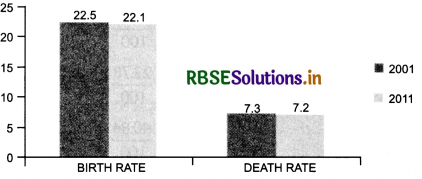
Question 2.
Which type of diagram can best represent the data given below? Draw it
|
Year |
Birth rate |
Death rate |
|
2001 |
22.5 |
7.3 |
|
201 1 |
22.1 |
7.2 |
Answer:
it would be most appropriate to represent the data through multiple bar diagram as it would enable the comparison of birth and death rate in two different years.
Question 3.
Present the given below as component bar diagram
Answer:
The data presented in a simple bar diagram as below:
Question 4.
Present the data given below in the form of diagram
Answer:
The data can be presented using a pie diagram as below:
Question 5.
Draw a histogram for the data given below. Also, find mode graphically.

Answer:
The data is presented in a histogram as below:
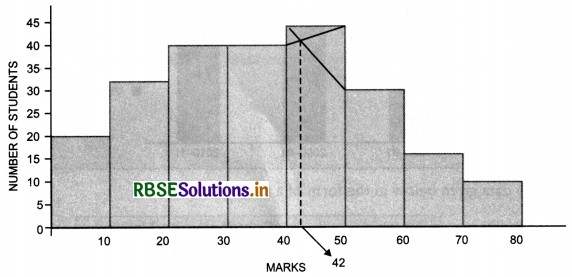
The highest rectangle corresponds to the class interval 40 - 50. This is the modal class. Join the top left comer of the modal rectangle with top right comer of the rectangle on the right Also, join the top right comer of the modal rectangle with top left comer of the rectangle on the left. Draw a perpendicular line from the point of intersection onto the x-axis. The value at which the perpendicular meets the x-axis is 42. Thus, Mode = 42.
Question 6.
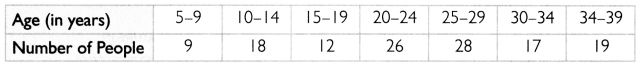
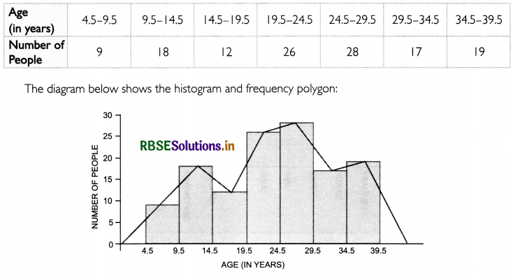
The data below shows the number of people in different age groups in a locality. Draw a historical and a frequency polygon for type data.
Answer:
The given senes is an inclusive series. Thus, it needs to be converted into exclusive series first as shown below;
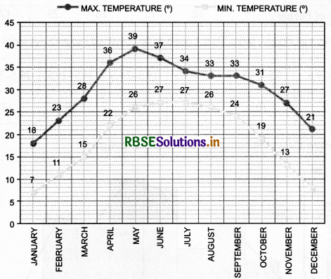
Question 7.
Present the data of maximum and minimum temperature observed in Delhi (in degrees) on a graph:
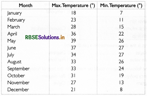
Answer:
Maximum and minimum temperature observed in Delhi is presented in the form of an arithmetic line graph:
Higher Order Thinking Skills
Question 1.
State the difference between table and tabulation.
Answer:
While tabulation refers to the method or process of presenting data in the form of row and columns, table refers to the actual presentation of data in the form of row and columns. Table is the consequence of tabulation.
Question 2.
Does tabular presentation of data suffer any limitation?
Answer:
Yes, tabular presentation of data suffers certain limitation. These are:
(i) It is difficult for a layman to comprehend tables.
(ii) It does not have a lasting impression.
Question 3.
Give one point of difference and one point of similarity between frequency polygon and frequency curve.
Answer:
Difference: All points in a frequency polygon are joined by using a foot rule while all points in a frequency curve are joined by freehand.
Similarity: Both frequency polygon and frequency curve are drawn by joining mid-points of all the tops of a histogram.
Objective Type Questions
Question 1.
Under which type of classification is the collected data is grouped with reference to time?
(A) Quantitative
(B) Qualitative
(C) Spatial
(D) Temporal
Answer:
(A) Quantitative
Question 2.
Caption’ stands for ..............
(A) Numerical information
(B) Column headings
(C) Row headings
(D) Table headings
Answer:
(B) Column headings
Question 3.
In which form is the data presented in a pie diagram?
(A) Percentages
(B) Degrees
(C) Absolute value
(D) Fractions
Answer:
(B) Degrees
Question 4.
Which of the following diagram could be made with the help of histogram?
(A) Frequency polygon
(B) Bar diagram
(C) Pie diagram
(D) Ogive
Answer:
(A) Frequency polygon
Question 5.
In a circle, IX is equal to: ........
(A) I°
(B) 6°
(C) 3.6°
(D) 10°
Answer:
(C) 3.6°
Question 6.
Which of the following is the formula of correction factor?
(A) \(\frac{\text { Class interval }}{\text { Least interval }}\)
(B) Class interval + Least interval
(C) Class interval x Least interval
(D) Class interval - Least interval
Answer:
(A)
Question 7.
How is a frequency curve drawn?
(A) Using ruler
(B) Using compasses
(C) Using protractor
(D) Using freehand
Answer:
(D) Using freehand
Question 8.
How many types of ogives are there?
(A) One
(B) Two
(C) Three
(D) Four
Answer:
(B) Two
Question 9.
Which statistical index can be determined with the help of ogives?
(A) Mean
(B) Median
(C) Mode
(D) Rank Correlation
Answer:
(B) Median
Question 10.
Which of the following is calculated to make the results comparable when bases of a histogram vary in their width?
(A) Absolute frequency
(B) Class frequency
(C) Frequency density
(D) Cumulative frequency
Answer:
(C) Frequency density
I. Fill in the blanks with correct answer.
I. A table is a systematic arrangement of data in ____ and
2. Footnote is written at the ______ of the table.
3. Spatial classification means classification of data according to ______
4. Classification of data according to standard of education such as illiterate, primary, secondary, graduate, technical, etc. will be known as _______ classification.
5. In bar diagram, comparison is based on _______ of the columns.
6. Sub-diagram is also called _______ bar diagram.
7. In pie diagram, each component is multiplied by _______
8. Ogives for more than type and less than type distribution intersect at _______
9. The total area under the frequency curve represents the total _______
10. In arithmetic line graph _______ is plotted along x-axis.
Answers:
1. rows, columns
2. bottom
3. place/location
4. qualitative
5. height
6. component
7. 3.6
8. median
9. frequency
10. time
II. State whether the following statements are true or false.
I. We can use short-forms in the table.
2. A column designation given to explain figures of the column is called ‘caption’.
3. Source note is the last part of the table.
4. Bar diagrams are suitable both for frequency type and non-frequency type variables and attributes.
5. Larger components are given priority in parting the bar in sub-diagram.
6. If the class intervals are of equal width, the area of the rectangles is proportional to their respective frequencies.
7. Histograms can be drawn both for discrete and continuous variables.
8. Frequency polygon is an alternate name for frequency curve.
9. Frequency polygon may not necessarily pass through all the points of the frequency polygon.
10. Less than ogive is never increasing and more than ogive is never decreasing.
Answers:
1. False
2. True
3. False
4. True
5. False
6. True
7. False
8. False
9. True
10. False
III. Match the following.
|
Column-I |
Column-II |
|
1. Diagram 2. Pie diagram 3. Ogive 4. Histogram
7. Stubs 8. Footnote 9. Captions 10. Title |
(A) A circle with components (B) Cumulative frequency curve (C) Arrangement of rows and columns (D) A drawing that represents information and relationship: (E) Represents frequency distribution of continuous senes (F) Row Headings (G) At bottom of the table (H) Column headings (I) Narrates the contents of the table (J) Presentation of data in the form of bars or rectangles |
IV. Read the following statement- Assertion (A) and Reason (R). Choose one of the correct alternatives given below:
Assertion (A): Width of bars in a bar diagram need not be equal.
Reason (R): Bar diagram comprises a group of equi width rectangular bars for each class of data.
Alternatives:
(a) Both Assertion (A) and Reason (R) are true and Reason (R) is the correct explanation of Assertion (A).
(b) Both Assertion (A) and Reason (R) are true and Reason (R) is not the correct explanation of Assertion (A).
(c) Assertion (A) is true and Reason (R) is false.
(d) Assertion (A) is false and Reason (R) is true.
Answer:
(d) Assertion (A) is false and Reason (R) is true.
V. Read the following hypothetical case study,carefully and answer the following questions on the base of the same:
Bar diagram comprises a group of equispaced and equiwidth rectangular bars for each class or category of data. Height or length of the bar reads the magnitude of data. The lower end of the bar touches the base line such that the height of a bar starts from the zero unit. Bars of a bar diagram can be visually compared by their relative height and accordingly data are comprehended quickly.
Data for this can be of frequency or non-frequency type. In non-frequency type data, a particular characteristics, say production yield, population, etc. at various points of time or 6f different states can be noted and corresponding bars are made of the respective heights according to the values of the characteristics to construct the diagram. The values of the characteristics retain the identity of each value.
1. A ____ is a drawing that represents information and relationships. (diagram/information)
2. In ____ diagram, data are presented in the form of rectangles. (bar/pie)
3. Bar diagram is a ____ dimensional diagram. (one/two)
4. Bar diagram comprises a group of ____ width rectangular bars for each class of data. (equi/varying)
Answers:
1. diagram
2. bar
3. one
4. equl

- RBSE Class 11 Economics Important Questions Chapter 9 पर्यावरण और धारणीय विकास
- RBSE Class 11 Economics Important Questions Chapter 3 Organisation of Data
- RBSE Class 11 Economics Important Questions Chapter 2 Collection of Data
- RBSE Class 11 Economics Important Questions Chapter 1 Introduction to Statistics for Economics
- RBSE Class 11 Economics Important Questions Chapter 6 Measures of Dispersion
- RBSE Class 11 Economics Important Questions in Hindi & English Medium
- RBSE Class 11 Economics Important Questions Chapter 8 Index Numbers
- RBSE Class 11 Economics Important Questions Chapter 7 Correlation
- RBSE Solutions for Class 11 Economics in Hindi Medium & English Medium
- RBSE Class 11 Economics Important Questions Chapter 5 Measures of Central Tendency
- RBSE Solutions for Class 11 Economics Chapter 7 Correlation