RBSE Class 11 Economics Notes Chapter 4 Presentation of Data
These comprehensive RBSE Class 11 Economics Notes Chapter 4 Presentation of Data will give a brief overview of all the concepts.
RBSE Class 11 Economics Chapter 4 Notes Presentation of Data
Textual and Tabular Presentation of Data:
Presentation of data is the process of putting the voluminous data in compact and presentable form. In textual presentation, data are presented within text.
In tabular presentation, data is organised in a tabular form, i.e. in rows and columns.
Kinds of Classification in Tabular Presentation:
- Qualitative classification - data is classified on the basis of certain attributes
- Quantitative classification - data is classified on the basis of numerical value
- Temporal classification - data is classified according to time
- Spatial classification - data is classified according to place

Components of a Table
- Table number
- Tittle
- Captions or column headings
- Stubs or row headings
- Body of the table
- Unit of measurement
- Source note
- Footnote
Diagrammatic Presentation of Data:
- A diagram is a drawing that represents information and relationships.
- In diagrammatic presentation, data is presented in the form of diagrams, figures, graphs, etc. to provide quickest understanding of the real situation.
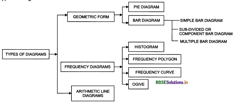
Types of Diagram:
 In bar diagrams, data are presented in the form of bars or rectangles.
- Pie diagram is a circle divided into various segments showing the percent values of a series.
- Histogram is a graphical presentation of a frequency distribution of a continuous series.
- Frequency polygon is a plane connected by line segments, formed by joining the middle-top points of all I rectangles in a histogram.
- Frequency curve is a smooth freehand curve, which passes very closely through the points of the ; frequency polygon.
- Ogive is the curve constructed by plotting cumulative frequency data on the graph paper, in the form of ; a smooth curve.
- Arithmetic line diagrams or time-series graph presents statistical data on a graph paper in which time is I plotted along x-axis and the value of the variable is plotted along y-axis.
