RBSE Solutions for Class 11 Economics Chapter 4 Presentation of Data
Rajasthan Board RBSE Solutions for Class 11 Economics Chapter 4 Presentation of Data Textbook Exercise Questions and Answers.
Rajasthan Board RBSE Solutions for Class 11 Accountancy in Hindi Medium & English Medium are part of RBSE Solutions for Class 11. Students can also read RBSE Class 11 Accountancy Important Questions for exam preparation. Students can also go through RBSE Class 11 Accountancy Notes to understand and remember the concepts easily.
RBSE Class 11 Economics Solutions Chapter 4 Presentation of Data
RBSE Class 11 Economics Presentation of Data Textbook Questions and Answers
Answer the following questions, 1 to 10, choosing the correct answer:
Question 1.
Bar diagram is a ..............
(i) one-dimensional diagram
(ii) two-dimensional diagram
(iii) diagram with no dimension
(iv) none of the above
Answer:
(i) Bar diagram is a one-dimensional diagram.

Question 2.
Data represented through a histogram can help in finding graphically the ....................
(i) mean
(ii) mode
(iii) median
(iv) all the above
Answer:
(iii) Data represented through a histogram can help in finding graphically the mode.
Question 3.
Ogives can be helpful in locating graphically the ..............
(i) mean
(ii) mode
(iii) median
(iv) all the above
Answer:
(iii) Ogives can be helpful in locating graphically the median.
Question 4.
Data represented through arithmetic line graph help in understanding
(i) long term trend
(ii) cyclicity in data
(iii) seasonality in data
(iv) all the above
Answer:
(i) Data represented through arithmetic line graph help in understanding long term trend.
Question 5.
Width of bars in a bar diagram need not be equal (True/False).
Answer:
False. Bar diagram composes a group of equi-width rectangular bars for each class of data.
Question 6.
Width of rectangles in a histogram should essentially be equal. (True/False)
Answer:
False. Width of rectangles in a histogram is equal if the class intervals are of equal width. However, if the data contains class intervals with varying width, it is convenient to use varying width of rectangles in a histogram.
Question 7.
Histogram can only be formed with continuous classification of data. (True/False)
Answer:
True. Histogram can only be formed with continuous classification of data so that all the rectangles are adjacent and there no open space between two consecutive rectangles.
Question 8.
Histogram and column diagram are the same method of presentation of data. (True/False)
Answer:
False. Column diagram is an afternate name for bar diagram, which are different from histogram.
Question 9.
Mode of a frequency distribution can be known graphically with the help of histogram. (True/False)
Answer:
True. Mode of a frequency distribution lies in the class with the highest bar in the histogram.
Question 10.
Median of a frequency distribution cannot be known from the ogives. (True/False)
Answer:
False. The intersection point of the ‘less than ogive’ and the ‘more than ogive’ gives the median of the frequency distribution.
Question 11.
What kind of diagrams are more effective in representing the following
(i) Monthly rainfall in a year
(ii) Composition of the population of Delhi by religion
(iii) Components of cost in a factory
Answer:
(i) Monthly rainfall in a year can be more effectively represented by simple bar diagram because it is a single variable. The longest bar would represent the month with the highest rainfall.
(ii) Composition of the population of Delhi by religion can be more effectively represented by a simple bar diagram.
(iii) Components of cost in a factory can be more effectively represented by a pie diagram. It will represent the percentage share of each component in the total cost incurred by the factory.
Question 12.
Suppose you want to emphasise the increase in the share of urban non-workers and lower level of urbanisation in India as shown in Example 4.2. How would you do it in the tabular form ?
Example 4.2: Census of India 2001 reported that Indian population hod risen to 102 crore of which only 49 crore were females against 53 crore males. 74 crore people resided in rural India and only 28 crore lived in towns or cities. While there were 62 crore non-worker population against 40 crore workers in the entire country, urban population had on even higher share of non-workers (19 crores) against the workers (9 crores) as compared to the rural population where there were 31 crore workers Out of a 74 crore population...
Answer:
The example has been represented ma tabular form as below:
Share of Urban workers and Non-worker in India (in crores)
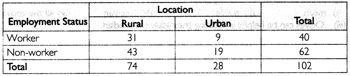
It is clear from the table that the share of urban non-workers is more as compared to urban worker. It can be concluded that the level of urbanisation in India is low.
Question 13.
How does the procedure of drawing a histogram differ when class intervals are unequal in comparison to equal class intervals in a frequency table
Answer:
In a histogram, height for area of a rectangle is the quotient of height (frequency) and base (width of the class interval). When class intervals are equal, that is, when all rectangles have the same base, area can easily be represented by the frequency of any interval for purposes of comparison. However, when class intervals are unequal, bases vary in their width. In such a case, the heights of rectangles are to be adjusted to yield comparable measurements. The class frequency divided by width of the class interval instead of absolute frequency to determine the frequency density.
Question 14.
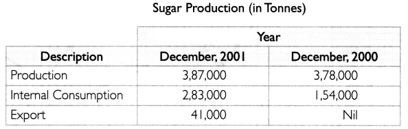
The Indian Sugar Mills Association reported that. Sugar production during the first fortnight of December 2001 was about 3.87,000 tonnes, as against 3,78,000 tonnes during the same fortnight last year (2000). The off-take of sugar from factories during the first fortnight of December 2001 was 2,83,000 tonnes for internal consumption and 41.000 tonnes for exports as against 1,54.000 tonnes for internal consumption and nil for exports during the same fortnight last season.
(i) Present the data in tabular form
(ii) Suppose you were to present these data in diagrammatic form which of the diagrams would you use and why
Answer:
(i) The table below represents the given information:
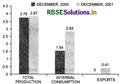
(ii) It would be most appropriate to represent the data through multiple bar diagram as it would enable the comparison of production, internal consumption and exports in two different years.
(iii) The diagrammatic presentation of the above data is shown below
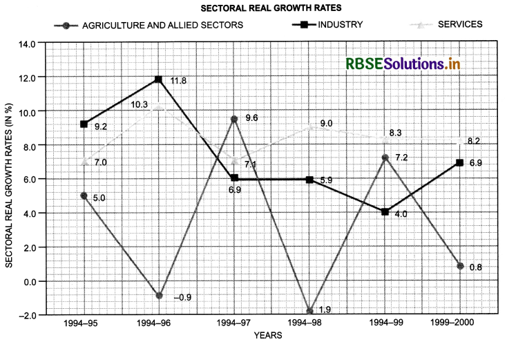
Question 15.
The following table shows the estimated sectoral real growth rates (percentage change over the previous year) in GDP at factor cost.
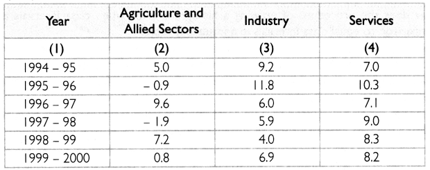
Represent the data as multiple time-senes graphs.
Answer:
The above data can be represented with the help of multiple time-series graphs in the following way:

- RBSE Solutions for Class 11 Accountancy Chapter 5 बैंक समाधान विवरण
- RBSE Solutions for Class 11 Accountancy Chapter 4 लेन-देनों का अभिलेखन-2
- RBSE Solutions for Class 11 Accountancy Chapter 6 तलपट एवं अशुद्धियों का शोधन
- RBSE Class 11 Accountancy Important Questions in Hindi & English Medium
- RBSE Class 11 Accountancy Important Questions Chapter 12 Applications of Computers in Accounting
- RBSE Class 11 Accountancy Important Questions Chapter 11 Accounts from Incomplete Records
- RBSE Class 11 Accountancy Important Questions Chapter 10 Financial Statements-II
- RBSE Class 11 Accountancy Important Questions Chapter 9 Financial Statements-I
- RBSE Class 11 Accountancy Important Questions Chapter 7 Depreciation, Provisions and Reserves
- RBSE Class 11 Accountancy Important Questions Chapter 6 Trial Balance and Rectification of Errors
- RBSE Class 11 Accountancy Important Questions Chapter 5 Bank Reconciliation Statement